Limited-Time Drink Launch Packaging:
How Custom Printed Cups Help Western Beverage Brands Run Seasonal Campaigns Without Chaos
Seasonal drinks are not cosmetic menu updates in the United States and Europe. They are structured revenue drivers. Limited-time launches create urgency, increase average ticket size, and re-activate customer routines. From pumpkin season in autumn to holiday flavors in winter and iced collections in summer, these campaigns are designed to create repeat visits and social buzz.
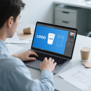
While brands invest heavily in ads, app banners, influencer content, and in-store visuals, the one asset every customer physically interacts with is the cup. Unlike digital ads, the cup cannot be skipped. Unlike emails, it cannot be ignored. It travels beyond the store, appears in offices and meetings, and becomes part of social media posts. In Western markets where lifestyle branding matters, the cup acts as a mobile media surface.
Yet many brands hesitate to customize cups for seasonal launches. Marketing wants bold visuals. Operations wants stability. Procurement wants predictable supply and cost control. The friction between these priorities often leads to compromise, and seasonal campaigns end up served in generic packaging.
The solution is not choosing between creativity and control. It is building a seasonal cup system that satisfies both.
The Real Internal Tension: Marketing vs Operations vs Procurement
Inside most Western beverage brands, seasonal packaging creates a three-way tension. Marketing teams push for visually distinctive cups that feel launch-worthy. Operations teams prioritize SKU simplicity and store efficiency. Procurement teams focus on stable lead times, forecast accuracy, and inventory risk.
All three perspectives are valid.
The most successful seasonal cup programs solve this tension by separating structure from artwork. The physical cup format remains stable. Sizes, paper specifications, and layout grids stay consistent. Only the printed seasonal layer rotates.
This approach reduces operational complexity while preserving campaign freshness. Operations continues using familiar formats. Procurement benefits from repeatable specifications. Marketing receives campaign-specific visuals.
For brands building structured seasonal programs rather than one-off print jobs, the process should begin with a defined customization framework here:
https://papercup-eg.com/custom/
Why the Cup Is the Most Efficient Campaign Surface
Seasonal campaigns rely on multiple channels, but most of them are fragmented and expensive. Ads expire. Posters get replaced. Social posts disappear in feeds. Cups remain present throughout the entire drink lifecycle.
Each cup is an unavoidable brand impression. Because cups are already required for service, the marketing impact carries minimal incremental cost. This makes seasonal cups one of the most cost-efficient branding tools in Western beverage operations.
A well-designed seasonal cup also increases shareability. Customers photograph visually distinctive packaging. They post it. They ask friends about it. The drink becomes a conversation starter. That amplification effect is difficult to replicate with traditional advertising alone.
To convert cups into reliable campaign assets, brands need controlled production systems, not improvisation. That planning starts here:
https://papercup-eg.com/custom/
Stable Base, Rotating Artwork: The Smart Seasonal Model
Many brands overcomplicate seasonal packaging. They redesign everything each quarter. Layout shifts. Brand marks move. Ink coverage changes drastically. This approach increases production risk and store confusion.
A smarter model keeps the structural foundation constant. Maintain consistent cup sizes. Maintain consistent brand placement. Maintain a stable layout grid. Then rotate seasonal elements within that framework.
You can update illustration themes, accent colors, taglines, or limited-time graphics without disrupting the base structure. This protects operational continuity while allowing creative refresh.
This system-driven approach also shortens approval cycles. Once the base template is locked, future seasonal updates require fewer internal reviews. That reduces campaign lead time and stress.
Brands looking to implement this model benefit from OEM/ODM collaboration during early design stages. That structured workflow typically begins here:
https://papercup-eg.com/custom/
Forecasting Without Seasonal Inventory Headaches
Forecasting is one of the biggest fears around seasonal packaging. Over-ordering creates obsolete stock. Under-ordering weakens campaigns mid-season and forces stores to revert to generic cups.
Western chains manage this risk through staged ordering and flexible design language. Instead of printing date-specific text, they use broader seasonal themes such as “Winter Collection” or “Holiday Menu.” This allows excess stock to remain usable longer.
They also plan reorder windows based on early performance metrics. The first wave covers launch demand. The second wave adjusts based on real sales.
Design flexibility and production consistency work together here. If the supplier cannot reproduce color and layout accurately across waves, the campaign loses visual unity.
A disciplined customization process reduces that risk and provides reorder confidence:
https://papercup-eg.com/custom/
Designing for Multi-Format Store Networks
Western beverage brands operate across diverse store formats—street cafés, mall kiosks, drive-thru locations, airports, and event stands. Seasonal cups must perform well across all of them.
Design must remain legible under different lighting conditions. It must survive rush-hour speed. It must photograph well for social media. It must align with both premium cafés and high-volume service environments.
The strongest seasonal designs avoid clutter. They use controlled color palettes, one strong focal element, and sufficient white space. Brand placement remains disciplined. Seasonal elements enhance the identity rather than overpower it.
Minimalist seasonal cups often look more premium and more modern in Western markets. But minimalism also exposes print errors. Slight color shifts and registration issues become visible. That is why manufacturing discipline is essential.
To ensure seasonal print quality remains consistent at scale, structured OEM production planning is required. The starting point is here:
https://papercup-eg.com/custom/
Collectible Seasonal Cups Without Supply Chaos
Limited-edition variations can drive repeat visits. Western consumers respond strongly to collectible drops. However, uncontrolled variation creates supply imbalance.
The most efficient collectible strategy keeps one base layout and rotates a single graphic element. For example, four characters within the same layout grid. This allows multiple designs without multiplying operational complexity.
Controlled variation maintains print stability and inventory predictability. It also protects brand coherence.
Collectible systems must be designed with manufacturing logic in mind, not only marketing creativity. That balance is best achieved through early-stage customization planning here:
https://papercup-eg.com/custom/
Seasonal drinks are growth tools in Western beverage markets. Seasonal cups can amplify that growth—but only when designed as systems rather than decorative afterthoughts.
A stable structural base combined with rotating artwork keeps marketing satisfied and operations stable. Forecast discipline reduces risk. Print consistency protects brand perception. We will go deeper into execution mechanics, lead-time control, quality assurance standards, procurement ROI logic, and long-term campaign scalability.
If you want to build a reliable seasonal cup program that supports both creativity and operational stability, begin with a structured customization framework here:
https://papercup-eg.com/custom/
How to Cut Lead Times With a Template-Based Cup System
Seasonal campaigns often fail for one boring reason: time. Marketing teams finalize flavors late. Product teams adjust recipes. Supply teams wait for approvals. Then packaging becomes the last-minute scramble. That scramble is expensive. It also creates mistakes.
The most reliable way to shorten lead time is to build a template-based cup system. You lock a master layout once. You approve placement rules once. You approve typography rules once. You approve the brand mark position once. After that, each seasonal campaign becomes a controlled “art swap,” not a full redesign.
This changes the internal workflow in a big way. Marketing no longer needs to re-argue logo placement every season. Operations no longer needs to re-check readability every season. Procurement no longer needs to re-evaluate a new set of specs every season. You remove repeated debates and replace them with a repeatable process.
In practice, this template system usually includes a fixed grid. It includes an approved safe area for legal marks. It includes a consistent zone for seasonal headlines. It includes one or two approved zones for seasonal graphics. It includes a stable color management approach so the same colors behave predictably across runs.
This template approach is also friendlier to manufacturing. It reduces registration risk because the layout does not change dramatically. It reduces ink surprises because coverage stays within a known range. It reduces production variability because the “base system” remains stable.
If you want to build a template-based seasonal cup workflow that can run year after year, start with a structured customization plan here: https://papercup-eg.com/custom/
How Western Brands Run Seasonal Campaigns Without SKU Explosion
A seasonal launch can quickly create SKU chaos. A brand might introduce three seasonal drinks, two sizes, multiple store formats, and different lid preferences. If packaging is built as “one unique cup per drink,” the SKU count explodes fast.
Western operators avoid this by designing packaging at the program level instead of at the drink level. They build one seasonal identity that can cover the full seasonal menu. Then they add a small system to indicate product differences only where needed.
A common approach is a shared seasonal cup design with a consistent seasonal theme. Then drink differentiation happens through stickers, handwriting, or a small color accent system. The seasonal cup becomes a campaign canvas, not a drink-specific label.
This does two important things. First, it keeps inventory manageable. Stores can stock one seasonal cup style instead of five. Second, it keeps the campaign visually unified. Every customer sees the same seasonal identity, which strengthens recognition.
If a brand truly needs multiple variations, the best method is “controlled variation.” You keep one base design and rotate one small element. That gives variety without operational chaos. It also allows predictable packing ratios for distribution.
This is where OEM planning matters. A supplier should help you design variations that remain stable in production. The program should be structured so stores can receive mixed cartons without confusion and without constant switching.
The customization workflow that supports a seasonal program approach begins here: https://papercup-eg.com/custom/
Designing Seasonal Cups That Photograph Well Without Looking Loud
In Western markets, seasonal cups must do two jobs at once. They must look good in the hand. They must also look good in photos. Social media is a major amplifier. Customers post seasonal drinks because they feel timely and shareable.
However, many seasonal cups become too loud. Brands try to cram too much into the design. The result looks like a poster, not a premium product. It also becomes harder to print consistently, because heavy ink coverage increases risk of drift and muddiness.
A photo-friendly cup design is usually simpler than people expect. It has one focal point. It has enough negative space. It uses a controlled palette. It preserves consistent brand placement. It avoids cluttered background textures that create noise in photos.
The seasonal message should be short. Western consumers respond better to short phrases than long descriptions. A short seasonal headline, paired with a bold graphic element, tends to work better than a full paragraph of copy.
The most effective seasonal cups also consider lighting. Many cafés use warm indoor lighting. Many customers take photos in daylight. Your colors should remain legible under both conditions. This is where controlled color selection and printing discipline become critical.
If you want seasonal cup designs that feel premium, photograph well, and remain stable in production, build your program through a customization process here: https://papercup-eg.com/custom/
How to Use Limited-Time Cups to Drive Repeat Visits
A seasonal cup should not only announce a flavor. It should support behavior. Western brands often treat limited-time launches as loyalty drivers. They use seasonal drinks to pull customers back more often during a short window.
Packaging can support that goal without turning the cup into an advertisement. The key is subtle, repeatable cues. For example, you can include a small “seasonal series” framing element that changes monthly. Customers begin to recognize the series. They come back to see what is next.
Another method is collectible variation. The cup becomes a set. Customers want all versions. This can work well for collabs, holiday seasons, or themed campaigns. However, collectible programs must be controlled. Too many variants create distribution imbalance. The best collectible programs use one base design and rotate one element.
You can also use the cup to support a simple ritual. A short phrase under the rim. A small seasonal “moment” message that feels like a reward. Western customers often respond well to small, thoughtful details. It feels human. It feels designed.
If you plan to use packaging as part of a retention program, you need consistent production. Inconsistent printing breaks the series effect. It also makes the brand feel less disciplined. Program consistency is the foundation.
To build a seasonal packaging system designed for repeat visits, use a structured custom workflow here: https://papercup-eg.com/custom/
How to Avoid Campaign Failure When Stores Run Out of Seasonal Cups
One of the worst outcomes in a seasonal campaign is running out of seasonal packaging mid-launch. Stores then switch back to generic cups. The campaign suddenly looks weaker. Customers notice. The brand loses momentum.
Western chains reduce this risk through two tactics: reorder planning and design flexibility.
Reorder planning means you set a reorder decision date in advance. You do not wait until inventory is almost gone. You monitor early sales. Then you decide whether to trigger the second wave while there is still time for production and shipping.
Design flexibility means you avoid hyper-specific dating on the cup. Instead of printing “Holiday 2026,” you print “Holiday Menu.” Instead of printing a one-week festival name, you print a seasonal theme. This protects leftover inventory. It also makes reorders easier because the same design can run longer if needed.
This strategy reduces fear inside procurement. When cups are not “dead stock” after a specific date, buyers are more willing to commit to an initial volume. That supports stronger launches.
This also requires supplier consistency. Reorders must match the first wave. If the second wave looks slightly different, the visual unity breaks. A good OEM partner should be able to control that.
For reorder-friendly seasonal cup planning, start here: https://papercup-eg.com/custom/
Quality Standards That Protect Brand Consistency During Seasonal Rush
Seasonal campaigns happen during high-pressure windows. Stores are busy. Staff are moving fast. That is exactly when packaging problems become most visible.
A seasonal program needs a clear quality standard. It should focus on what customers notice. It should also focus on what store teams rely on.
Key standards usually include color stability, registration stability, and print cleanliness. If your design uses large solid areas, ink uniformity matters. If your design uses fine typography, sharpness matters. If your design uses gradients, consistency matters. Many brands avoid gradients for this reason, because they can be sensitive to variation.
You should also standardize paper tone expectations. Clean, consistent paper tone makes the cup feel premium. In Western premium segments, customers notice small differences. A cup that looks slightly gray or inconsistent can weaken the campaign’s premium feel.
Quality control should be planned as part of the program, not an afterthought. That includes sampling rules, approval steps, and batch verification. The supplier should be aligned on what is acceptable and what is not.
If you are building a long-term seasonal cup program, you want a supplier who can support stable quality across multiple seasons, not only one run. That level of stability typically comes from disciplined process control.
To build a seasonal program with clear QC expectations, start with your customization plan here: https://papercup-eg.com/custom/
How Procurement Teams Evaluate Seasonal Cup Programs in the West
In Western beverage brands, procurement teams do not approve seasonal packaging because it looks nice. They approve it because it makes business sense. That business sense usually falls into three categories: program stability, cost control, and waste risk.
Program stability means fewer surprises. Procurement prefers stable formats and stable suppliers. They prefer repeatable specs. They prefer fewer emergency shipments. A template-based seasonal system supports this.
Cost control means understanding the cost structure. Seasonal cups may add printing complexity, but the incremental cost often becomes reasonable at volume. Procurement wants predictable pricing and predictable lead time. They also want clarity on what changes the price: ink coverage, color count, special finishes, or more complex approvals.
Waste risk means avoiding dead inventory. Procurement teams often resist seasonal packaging because leftover units can become unusable. This is why semi-seasonal messaging is so useful. It protects inventory value. It also makes reorders safer.
When you frame seasonal cups as a repeatable program instead of a one-off design, procurement is more likely to support it. It becomes a managed system with predictable controls, not a marketing gamble.
To present seasonal cups as a procurement-friendly program, anchor the workflow through your customization hub here: https://papercup-eg.com/custom/
How to Align Seasonal Cups With Brand Identity Across Years
Many brands treat each season as a totally new identity. That can work for experimental brands, but it often weakens long-term recognition. Western consumers like novelty, but they also like consistency. They want to recognize the brand quickly.
A better approach is to build a seasonal design language that evolves but remains recognizable. For example, you keep the same seasonal series structure each year. You update the illustration theme. You refresh the accent palette slightly. You keep the brand placement stable. You keep the typography system stable.
This creates two benefits. Customers recognize the “seasonal moment” instantly. Operations teams also find it easier to work with because the system remains familiar. Procurement finds it easier to reorder because the specs remain stable.
This is how seasonal packaging becomes a long-term asset. It is not just an annual creative exercise. It becomes a recognizable campaign platform.
If you want to build a seasonal system that strengthens brand identity year after year, start with a structured customization framework here: https://papercup-eg.com/custom/
How EVER GREATER Fits Seasonal Campaign Programs
Seasonal packaging is both a printing challenge and a supply discipline challenge. Brands need a partner who can deliver clean, consistent printing at scale. They also need stable production and repeatability across waves.
EVER GREATER’s long printing experience supports high-fidelity seasonal designs. OEM capability supports stable output at volume. ODM capability supports design decisions that remain manufacturable, readable, and consistent across seasons.
For B2B buyers, the value is not only that the cup looks good. The value is that the program remains calm. It launches on time. It stays consistent. It can reorder without drama. It can scale across store networks.
If you want to build a seasonal cup program that runs reliably and supports long-term growth, the best starting point is your customization hub here: https://papercup-eg.com/custom/
Seasonal drink launches drive growth in Western markets. Custom printed cups can amplify that growth, but only when the program is designed as a system. A template-based layout shortens lead time. A stable base format prevents SKU chaos. A controlled seasonal layer keeps marketing fresh without disrupting operations. Staged ordering reduces forecasting stress. Clear quality standards protect brand consistency during rush periods. A procurement-friendly structure makes approvals easier and reorders safer.
If your goal is to run limited-time campaigns that feel exciting to customers but stable to operators, start building the program through a structured customization process here: https://papercup-eg.com/custom/