Allergen-Smart Paper Cups:
How Color and Icon Systems Reduce Drink Mistakes in Western Coffee Shops
Customization has become the foundation of modern coffee culture in the United States and Europe.
Customers no longer order “coffee.”
They order oat milk lattes with one pump of vanilla, half-caf, extra hot, no foam.
They order almond milk flat whites with sugar-free syrup.
They order dairy-free cappuccinos for pickup through mobile apps.
Customization increases average ticket size.
It increases loyalty.
It increases perceived personalization.
But it also increases operational complexity.
Every modifier adds cognitive load to staff.
Every substitution adds a potential failure point.
Every mobile order reduces real-time verification.
In Western high-volume cafés, drink errors are not rare. They are predictable. They happen because service is fast, menus are complex, and cups look similar once sealed.
When mistakes occur, they cost more than ingredients.
They cost time.
They cost queue speed.
They cost staff morale.
They cost online ratings.
They cost brand trust.
In allergen-sensitive situations, they can cost far more.
This is why packaging has quietly become part of the operational solution.
Allergen-smart paper cups are not decorative upgrades. They are structural tools that reduce confusion in real environments.
Why Cups Become the Final Verification Tool
In traditional cafés, customers watched drinks being prepared. Today, that is less common.
Mobile ordering dominates urban Western markets.
Delivery platforms remove face-to-face interaction.
Drive-thru models prioritize speed.
Corporate catering adds bulk distribution.
In all these cases, the cup becomes the last physical proof of correctness.
Once the lid is on, visual similarity increases.
Without a structured identification system, staff rely on memory and handwriting.
Handwriting fails under speed pressure.
Marker ink smears.
Names are abbreviated.
Abbreviations differ by store.
When identification depends only on writing, errors multiply.
This is where allergen-smart paper cups provide structured reinforcement.
Instead of relying only on handwriting, the cup itself supports categorization.
Icons support scanning.
Color coding supports sorting.
Label zones support clarity.
Layout supports consistency.
Packaging becomes a silent assistant.
Understanding Allergen Risk in Western Coffee Culture
Western markets show higher awareness of dietary restrictions than many regions.
Lactose intolerance is common.
Nut allergies are serious and widely recognized.
Plant-based alternatives are mainstream.
Sugar-free preferences are normal.
Caffeine sensitivity is openly discussed.
Customers expect brands to manage these variables safely.
Operationally, that means drinks must be clearly identified even after preparation.
A mis-labeled dairy drink given to a dairy-free customer may result in inconvenience.
A nut contamination error may create medical risk.
Even minor confusion can escalate through social media.
This reality transforms packaging from branding to responsibility.
Allergen-smart paper cups help mitigate this risk without slowing service.
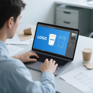
What Makes a Paper Cup “Allergen-Smart”
An allergen-smart paper cup is built around clarity and repeatability.
It does not overload the surface.
It does not look like a warning label.
It integrates structure into design.
Core elements often include:
A minimal icon language
A disciplined color coding system
A defined label writing zone
Placement consistency across cup sizes
Compatibility with lids and sleeves
The system must work under speed.
If it requires thinking, it fails.
That is why simplicity is the governing principle.
To design a scalable allergen-smart cup program, the development process should begin with a structured customization workflow:
https://papercup-eg.com/custom/
The Psychology of Icons in High-Speed Environments
Icons outperform text in rushed environments.
Human brains process shapes faster than words.
In crowded counters, staff do not read full phrases.
They recognize patterns.
A bold leaf symbol instantly signals plant-based.
A clear “D” signals decaf.
A small nut-alert icon signals caution.
A crossed milk drop signals dairy-free.
Icons create visual anchors.
The best icon systems follow three rules:
They are thick-lined.
They use strong contrast.
They remain legible on curved surfaces.
Fine line art fails in print.
Thin typography fades under café lighting.
ODM design support ensures icons remain manufacturable at scale.
OEM production ensures they remain consistent across large orders.
Color Coding as a Secondary Confirmation Layer
Color is even faster than icons.
Color-coded paper cups create sorting efficiency.
They help runners quickly group drinks.
They reduce pickup confusion.
However, color must remain disciplined.
A practical Western café system usually includes:
One primary color for dairy drinks.
One primary color for plant-based drinks.
A small accent for decaf.
A high-visibility accent for allergen attention.
More than four colors creates hesitation.
Color consistency becomes critical.
If batches drift in tone, trust erodes.
Professional print control is not aesthetic luxury.
It is operational necessity.
This is where long-term printing expertise becomes a competitive advantage.
The Label-Zone Concept: Supporting Real Café Behavior
Many cafés will continue to use markers.
Instead of fighting that reality, design around it.
A clean label-zone provides:
A high-contrast background
Light guide lines
Short modifier checkboxes
Clear name area
This reduces messy handwriting.
It improves readability.
It reduces remake risk.
Placement must account for sleeves.
Placement must account for grip zones.
Placement must remain consistent across sizes.
ODM planning prevents layout conflicts before production.
For system-level development and layout planning, begin here:
https://papercup-eg.com/custom/
Why Systems Fail Without Manufacturing Discipline
Many packaging ideas look good in concept.
They fail in production.
Common failures include:
Color drift between batches
Icon misalignment
Registration shifts
Ink smearing in label zones
Inconsistent white balance
When systems rely on color coding and icons, these issues are not cosmetic. They are functional failures.
Stable OEM production prevents this.
Consistency builds trust.
Trust reduces hesitation.
Reduced hesitation increases speed.
For chains, repeatability across stores matters more than creative complexity.
The Operational ROI of Allergen-Smart Paper Cups
Procurement teams evaluate cost differently from marketing teams.
They calculate:
Ingredient waste from remakes
Labor time from corrections
Refund rates
Queue delays
Customer complaint volume
If a structured cup system reduces mistakes even slightly, the ROI multiplies across high-volume operations.
Even a one percent reduction in remakes can create meaningful savings over a year.
In Western review-driven markets, operational reliability directly affects ratings. Ratings affect traffic.
Allergen-smart cups therefore contribute indirectly to revenue stability.
Integrating the System Into Staff Training
Packaging systems only work when staff adopt them.
The best rollout strategy includes:
One-page icon reference
One-page color guide
Quick shift training
Simple rule hierarchy
The simpler the system, the faster it becomes automatic.
When production remains stable across orders, training remains valid.
When packaging changes unpredictably, confusion returns.
OEM stability supports long-term adoption.
Why EVER GREATER’s Structure Fits This Program
Allergen-smart paper cups require precision printing and scalable OEM capability.
They also benefit from coordinated components, especially lids.
With experience in printing and injection molding, EVER GREATER can support full-system development rather than isolated cup production.
OEM execution ensures repeatability.
ODM collaboration ensures practical design.
In-house capability reduces coordination risk.
For brands looking to build allergen-smart paper cup systems at scale, start here:
https://papercup-eg.com/custom/
Why Pickup Shelves and Delivery Made Cup Identification a Brand Issue
In many US and European cities, pickup shelves have become the busiest “storefront” a café has. Customers walk in, scan a wall of cups, and grab what they believe is theirs. That moment is fast. It is also fragile.
When cups look similar, the pickup shelf becomes a mistake engine. One customer grabs the wrong drink. Another customer returns angry. Staff must remake. The line slows. Everyone loses.
Delivery adds another layer. Drinks may be packed into bags. Labels may peel. Condensation may blur ink. Drivers may swap orders. Customers may not know the store or staff. They only see packaging.
This is why allergen-smart paper cups are not only a safety tool. They are a customer experience tool. A structured cup identification system reduces confusion at the exact touchpoints where modern Western beverage operations struggle most.
For many brands, this is also where packaging starts influencing online ratings. Customers often judge a brand’s “accuracy” and “care” based on the last mile. If the cup makes it easy to confirm “this is oat, this is decaf,” customers feel safer. They complain less. They trust more.
To build a repeatable identification system that works for pickup and delivery, start your custom program planning here:
https://papercup-eg.com/custom/
The Drive-Thru Reality: Packaging Must Communicate in Seconds
Drive-thru is growing in North America and expanding in parts of Europe. The logic is simple. Convenience wins.
But drive-thru compresses time. Staff have fewer seconds to verify each drink. Customers have fewer opportunities to check. Drinks are passed through windows fast. Once the cup enters a car, the customer may not want to open lids or inspect.
That makes visual clarity on the cup essential.
An allergen-smart cup system helps drive-thru in three ways:
First, it reduces internal mistakes. Runners can sort faster. Baristas can verify faster.
Second, it reduces handoff confusion. A clear icon set makes it easier to confirm quickly.
Third, it reduces post-handoff dissatisfaction. Customers can recognize what they ordered without guessing.
In drive-thru, a small improvement becomes a big advantage. Even a slight reduction in remakes can improve throughput at peak hours. That translates into revenue.
This is why Western operators increasingly see packaging as part of “speed engineering.” Not just branding.
If you want to develop a drive-thru-friendly cup system with consistent print and layout rules, use:
https://papercup-eg.com/custom/
Building the “Two-Second Rule” Into Your Cup Design
A useful design principle for allergen-smart cups is the two-second rule.
If a staff member cannot identify the key modifier within two seconds, the system is too complex.
Key modifiers typically include:
Dairy versus plant-based
Decaf versus regular
Allergen attention markers for nut concerns
Optional: sugar-free versus standard for certain menus
Two seconds means the design must be instantly scannable. That pushes brands toward:
Large, simple icons
Limited color groups
Clear placement rules
Dedicated writing zones that do not compete with icons
It also means you should avoid decorative elements that reduce readability. Busy patterns look nice in photos. They slow human scanning in real operations.
The two-second rule is also why “less is more” often wins in Western café packaging. Clean design is not only trendy. It is functional.
To build a two-second system through an OEM/ODM customization workflow, start here:
https://papercup-eg.com/custom/
A Practical Hierarchy: What Should the Cup Communicate First
A common mistake is trying to communicate everything. That turns a cup into a messy checklist. Staff ignore it.
In Western cafés, the most useful hierarchy is usually:
Priority 1: Dairy status
Priority 2: Decaf status
Priority 3: Allergen attention flag
Priority 4: Optional dietary flags, only if your menu demands them
If you try to encode every syrup and every topping, the system becomes too heavy. Most of that information belongs in POS tickets, stickers, or internal labels.
The cup system should be a verification shortcut. It should reduce risk for the highest-impact errors. Milk and caffeine are two of the biggest. Allergens are the highest risk category. So focus there first.
This is also how you keep training simple. Western operators prefer systems that new staff can learn in one shift.
For program design support and custom printing execution, start here:
https://papercup-eg.com/custom/
How to Design for Marker Notes Without Losing Premium Look
Many brands worry that a label zone makes a cup look clinical. That happens when the zone is too large or too “form-like.”
A better approach is to treat the writing space as part of the graphic system. It can be a clean panel. It can be a light tint block. It can be integrated into the brand layout.
You can also design the label zone for real marker behavior:
Use a matte-friendly surface where possible, so ink does not smear.
Avoid dark backgrounds where writing becomes unreadable.
Avoid heavy varnish effects in the writing area.
Keep the zone away from condensation-heavy areas for cold programs.
Even on hot cups, smearing can happen because staff hands may be wet or gloved. The writing zone should be forgiving.
This is where manufacturing experience matters. A good supplier can advise on surface and print decisions that support real use, not only visual mockups.
If you want to build a writing zone that stays clean at volume, use:
https://papercup-eg.com/custom/
The Lid Factor: Why “Cup-Only” Systems Still Fail
Many drink errors happen after lidding. Once lids are on, cups look more alike. This is true for hot drinks and iced drinks.
If your system relies only on icons printed on the cup body, it works well when the cup is visible. It becomes weaker when cups are crowded on pickup shelves or bagged for delivery.
This is why mature allergen-smart systems treat cups, lids, and sleeves as one identification ecosystem.
Even without adding new links or complicated components, you can support better verification by coordinating:
Icon placement so it stays visible above sleeve lines
Accent color bands that remain visible after lidding
Consistent orientation rules so staff know where to look
If you have injection molding capability in your supply chain, lids can carry additional cues. Many Western buyers see that as a premium operational feature. It makes accuracy easier without extra steps.
To plan cups and accessories as a unified program through customization, start here:
https://papercup-eg.com/custom/
Rollout at Scale: How Chains Keep Consistency Across Locations
Scaling is where most “smart packaging” ideas fail.
A concept may work in one flagship store. Then the brand expands. Now there are dozens of locations. Staff turnover increases. Procurement becomes more cost-sensitive. Suppliers change. Small inconsistencies appear. The system collapses.
To prevent this, chains need:
A standardized icon kit with fixed line weights and sizes
A defined color palette with print standards
A defined placement grid that applies to every cup size
A consistent writing zone location across formats
A stable manufacturing partner that can reproduce the system reliably
This is why OEM discipline matters. When you lock specifications, you build operational trust. When the system stays the same month after month, staff learn it and rely on it.
ODM support also matters during expansion. A chain may add new menu items. The system must evolve without breaking. Adding one new icon should not create confusion. A good program anticipates growth.
If you want to build a chain-ready allergen-smart cup system, use:
https://papercup-eg.com/custom/
Quality Control That Matches Operational Risk
Traditional QC often focuses on print appearance. For allergen-smart cups, QC must focus on function.
A functional QC checklist should include:
Icon clarity at real viewing distance
Color accuracy under warm café lighting and daylight
Registration stability on curved surfaces
Contrast levels for the writing zone
Ink resistance in the writing zone to reduce smearing
Consistency across batches, not only within a batch
The goal is not perfection for art. The goal is reliable recognition.
Western buyers often judge suppliers by consistency more than creativity. A system that looks slightly different each reorder undermines staff confidence. That increases error risk.
For a program that survives operational reality, QC must be built into the supplier relationship.
To set up consistent production and QC standards in your custom program, start here:
https://papercup-eg.com/custom/
A Procurement-Friendly ROI Model: How to Justify the Upgrade
Many buyers ask one question first: does the new cup system justify the cost?
The best way to explain ROI is to avoid vague brand language. Use operational math.
Consider a store that serves 600 drinks per day. Assume a remake rate of 2 percent. That is 12 remakes per day. If each remake costs labor time and ingredients, the annual cost becomes significant.
Now assume an allergen-smart system reduces remakes from 2 percent to 1.6 percent. That seems small. But it reduces remakes by 20 percent. Over a year, that can offset a meaningful portion of the packaging upgrade.
Then add soft ROI:
Fewer negative reviews
Fewer refund escalations
Faster service at peak hours
Higher staff confidence
Lower training confusion during onboarding
In Western markets, these factors are often more valuable than unit-cost differences. That is why many chains invest in systems that reduce friction.
An allergen-smart cup system is not a “design upgrade.” It is a process improvement tool.
To develop a program that procurement teams can approve with confidence, use:
https://papercup-eg.com/custom/
Risk Management: Why Allergen-Smart Cups Support Brand Safety
Allergen incidents are rare in most operations. But when they happen, the consequences are severe.
Western consumers expect brands to take allergen handling seriously. They also expect clear communication. Even when brands follow correct handling procedures, packaging that looks ambiguous makes customers feel unsafe.
Allergen-smart cups support brand safety by increasing transparency. They help customers confirm what they received. They also reduce accidental swaps.
This reduces complaint probability. It also reduces the chance of escalation.
Even if your brand never faces a serious incident, “perceived safety” matters. In Western markets, perceived safety is part of premium positioning. Customers trust brands that look organized, consistent, and thoughtful.
Packaging plays a direct role in that perception.
To build a brand-safe identification system, start here:
https://papercup-eg.com/custom/
Future-Proofing: How This System Works With Digital Ordering Trends
Digital ordering will keep growing. More drinks will be made without direct customer interaction.
That means packaging will carry more responsibility for verification.
In many Western chains, POS tickets already print modifier details. But tickets fall off. Ink fades. Bags hide labels. The cup remains the most visible element.
An allergen-smart cup system complements digital ordering. It acts as a fail-safe layer. Even when tickets are missing or unclear, the cup’s system cues remain visible.
As brands adopt more automation, consistency becomes even more important. Automated workflows assume standard packaging. If each store uses different handwriting habits, automation loses accuracy. Structured cup systems reduce variability.
This is another reason chains move toward standardized icons and color cues. It supports modern operations.
To develop packaging systems that align with modern ordering models, start here:
https://papercup-eg.com/custom/
Final Thoughts: Why This Is More Than Packaging
Allergen-smart paper cups reduce drink mistakes. That is the direct value.
But they also do more.
They reduce friction at pickup shelves.
They support drive-thru speed.
They strengthen brand trust.
They reduce operational noise for staff.
They support a consistent guest experience across stores.
In Western coffee markets, experience is built from small details. Accuracy is one of those details. Customers return to brands that feel reliable.
When your packaging helps your operations stay reliable, your packaging becomes a growth asset.
This kind of program needs stable printing, repeatable production, and a clear design system. It also benefits from OEM and ODM collaboration.
To start building an allergen-smart paper cup program that can scale, use:
https://papercup-eg.com/custom/