Accessible Paper Cups:
How Tactile and Braille Packaging Builds Inclusive Beverage Brands
In the US and Europe, beverage brands compete hard for attention. Most brands fight through flavors, seasonal menus, and social media. Yet many customers judge a brand in a more human way. They ask a quiet question: does this brand care about people?
That is why accessible packaging is gaining momentum. It is not only a compliance topic. It is a brand signal. It shows empathy. It shows modern thinking. It also improves real customer experience for people with visual impairments, seniors, and anyone who benefits from clearer, more tactile cues.
For coffee chains and beverage brands, paper cups sit at the center of daily life. They travel through offices, campuses, train stations, and streets. A cup is not only packaging. It is a public brand object. When accessibility is built into that object, the brand communicates values in a simple, visible way.
This is also a practical business opportunity. Accessible paper cups can reduce service mistakes. They can help customers distinguish hot drink types. They can support safer handling. They can also create a “talkable” point of difference that Western consumers and media often respect understanding it is not a gimmick.
For B2B buyers, the question becomes simple: can we make inclusive packaging scalable, consistent, and still premium? With the right OEM and ODM partner, the answer is yes.
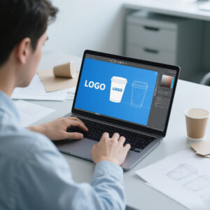
What accessible paper cups actually mean
Accessible paper cups are cups that help more people identify and use the product safely. They typically include one or more of these elements:
Braille dots that label drink type, temperature warnings, or brand messages
Tactile patterns that help customers distinguish sizes or beverage categories
High-contrast print and clear icon systems for quick recognition
Easy-grip textures that improve handling for seniors and people with limited dexterity
System cues that match cups with lids, sleeves, and carriers
The goal is not to overload the cup with information. The goal is to add a few cues that work in real life. In Western markets, the most successful accessible designs feel clean and intentional. They fit premium branding. They also feel respectful.
Importantly, accessibility elements must be manufacturable at scale. That requires controlled processes. It also requires good design decisions. It cannot be a one-off experiment.
Why this topic resonates with coffee and beverage brands
Coffee shops are community spaces in Western culture. They are places for work, social time, and routine. Many brands want to be seen as welcoming spaces. Packaging that supports accessibility reinforces that promise.
There is also a practical service angle. Customers often order quickly. Staff work under pressure. Drinks may look similar. In busy shops, mistakes happen. An accessible cup system can reduce confusion. It can help label hot versus iced. It can help label dairy-free options. It can help label decaf. It can also help customers confirm what they received.
These improvements help both sides. Customers gain confidence. Staff gain speed. The brand gains trust.
This is why accessible packaging is not only a moral choice. It can also be an operational advantage.
Braille on paper cups: what works and what fails
Braille sounds simple. In practice, it is easy to do poorly. When Braille is shallow, inconsistent, or placed badly, it becomes unreadable. When it is placed where sleeves cover it, it becomes useless. When it is too close to seams or folds, dots distort.
A successful Braille paper cup program focuses on three factors.
Dot height and clarity must be consistent.
Dot placement must avoid high-friction zones.
The Braille content must be meaningful and short.
For example, Braille can label cup size. It can label a drink type. It can label temperature warning. It can also label a key allergen note. The content should be practical. It should not try to tell the full story. That is what print and digital content can do.
From an OEM and ODM perspective, Braille features require careful production planning. The manufacturing partner must control forming consistency. The partner must also support repeatability at high volume.
This is where a supplier with real experience matters. You are not just printing. You are shaping a tactile interface.
Tactile packaging beyond Braille: texture can be a powerful signal
Many Western brands use texture as a premium cue. Soft-touch finishes, matte textures, and subtle patterns already exist in premium packaging. Accessibility takes this further. Texture becomes a functional signal.
A tactile band can indicate cup size.
A raised icon can indicate hot beverage.
A textured stripe can indicate decaf.
A patterned area can indicate dairy-free.
These cues are easy to learn. They also work for customers who are not Braille readers. That is a key advantage.
In practice, many brands combine tactile cues with a clean icon system. The tactile cue supports quick feel-based checks. The icon supports quick visual checks. Together, they reduce mistakes and improve experience.
Why tactile cues are especially useful for delivery and pickup
Pickup and delivery are now a major part of Western beverage business. Customers may not interact with staff. They may receive multiple drinks in one order. In that context, labeling matters.
Accessible cups can support safer pickup. Customers can confirm what they received. They can also identify hot drinks more easily. Tactile cues also help in low-light situations such as commuting or driving.
This is not only about disability. It is about real-life usability. Accessibility and usability overlap strongly. Western brands increasingly understand this.
Designing an accessible cup system: start with a simple “language”
The biggest risk with accessibility design is complexity. If every drink gets a unique tactile code, the system becomes hard to learn. It also becomes hard to manufacture consistently.
The best approach is to create a small tactile language.
One cue for hot vs cold.
One cue for size.
One optional cue for decaf or dairy-free.
That is enough to create meaningful benefit. It also keeps production practical.
For B2B chains, the system must be scalable. It must also be consistent across locations. That is why the tactile language should be simple and standardized.
Manufacturers with ODM capability can help develop this language. They can advise which cues are feasible. They can also advise where cues should sit on the cup to avoid sleeve coverage and grip zones.
To explore custom cup development workflows, you can use this internal link:
https://papercup-eg.com/custom/
Printing still matters: accessibility can look premium
Some brands worry that accessible packaging will look “medical.” That is not true. In Western markets, the best accessible packaging looks modern and premium.
Clean typography. Strong spacing. Clear icon design. Subtle tactile cues. Those elements actually align well with Western premium branding trends.
High-contrast print helps readability for many customers. It also photographs well. It improves brand clarity in social media and in-store visuals.
This is where professional printing matters. Fine icons need sharp registration. Consistent color matters for recognition. Clean white space requires stable paper tone and controlled ink spread.
Your company’s strength in printing and manufacturing is a strong match. Accessibility requires discipline. It rewards manufacturers who can control details.
How lids and accessories fit into accessibility
A cup is part of a system. Lids matter. Sleeves matter. Carriers matter.
In many beverage programs, lids are injection molded. This creates an opportunity for tactile design. A lid can include raised markings. It can include a textured grip. It can include a shape cue that helps identification.
This plays directly into your company’s background. With injection molding capability, you can coordinate cup and lid cues as one integrated system. That is valuable for B2B buyers who want fewer suppliers and fewer compatibility problems.
Accessibility also interacts with sleeves. If a sleeve covers Braille or tactile cues, the system fails. So design must consider sleeve placement. It must also consider whether the brand uses double wall cups. These decisions should be made early.
The customization workflow should include cup, lid, and sleeve planning. This is where OEM and ODM capability matters.
Reference your customization entry here:
https://papercup-eg.com/custom/
Cold drink programs: keeping accessibility consistent across formats
Many brands offer both hot and cold drinks. They want a consistent system.
Cold drinks often use PET cups. Tactile cues can still work there. Lids can still carry raised icons. Printed icons can still use high contrast. A consistent “language” across hot and cold formats improves customer experience.
If your site includes PET cup programs, this internal link can support that content cluster:
https://papercup-eg.com/product-category/all-products/pet-cups/
And the main customization entry remains:
https://papercup-eg.com/custom/
This format consistency is attractive to Western buyers. They want one packaging strategy. They want it across the menu. They want it across seasons.
How to pitch accessible paper cups internally: the B2B decision logic
In many beverage companies, accessibility needs an internal business case. The strongest case usually includes four points.
Brand differentiation. Accessibility is still rare in mainstream beverage packaging. It stands out.
Customer trust. People respect brands that design for more people.
Operational benefits. Clear cues reduce mistakes and remakes.
Content value. Accessibility initiatives often generate positive stories and partnerships.
For Western markets, authenticity is key. The initiative must be real. It must be consistent. It must not be a one-off PR moment. Packaging is a good place to make it real, because it touches every transaction.
OEM and ODM roles: turning an inclusive idea into a scalable program
Accessible packaging starts as an idea. Then it becomes a program.
ODM support helps you design tactile cues that are feasible. It helps you pick placements that remain visible. It helps you balance aesthetics, usability, and manufacturability.
OEM execution ensures consistency at volume. That is critical. If dots vary, Braille fails. If textures vary, the tactile language breaks. If print contrast varies, readability drops.
For chains and distributors, repeatability matters more than novelty. That is why experienced manufacturing partners are essential.
If you want to position EVER GREATER as the “program partner” for accessible packaging, your customization page is the natural internal link:
https://papercup-eg.com/custom/
Why inclusive packaging feels “modern” in the US and Europe
In Western markets, inclusivity is not a niche conversation. It is part of mainstream culture. Many consumers expect brands to design for more people. They also expect brands to act with empathy.
Packaging is one of the easiest places to show that empathy. It is visible. It is practical. It touches every customer.
Inclusive packaging also fits the “experience” mindset. Western consumers value thoughtful details. They notice when a brand reduces friction. They also notice when a brand makes daily life easier.
When accessibility is integrated cleanly, it does not feel like a charity project. It feels like good design. That is an important distinction. The best accessible paper cups feel premium and intentional.
Accessible paper cups can reduce mistakes and remakes
For coffee shops and beverage chains, mistakes cost money. They also cost time. They also hurt customer trust.
Many mistakes happen because drinks look similar. A hot latte can look like a hot decaf latte. An oat milk latte can look like a whole milk latte. A black tea can look like a coffee in a lidded cup.
Visual labels help. Tactile cues add another layer. They allow staff and customers to double-check quickly.
In pickup and delivery, this becomes even more useful. Customers may receive multiple drinks. They may carry them in low light. They may not open lids to check.
A tactile system can reduce errors in these moments. That can cut remakes. It can also reduce refund requests.
For B2B buyers, this is a strong operational argument. It makes accessibility a performance tool, not only a values statement.
A simple tactile “coding system” that Western brands can adopt
Accessible packaging works best when it uses a simple language. Too many codes confuse people. A few consistent signals help.
Here is a practical structure many brands can use:
Cue 1 is for temperature. Use one raised band for hot drinks. Use a smooth area for cold drinks.
Cue 2 is for size. Use one raised dot cluster for small. Use two clusters for medium. Use three for large.
Cue 3 is optional for special requests. Use a raised icon for decaf. Use a different icon for dairy-free.
This system is simple. It is learnable. It is scalable.
It also works for customers who do not read Braille. That is critical. Many visually impaired people do not use Braille daily. Texture still helps.
A manufacturer with ODM capability can refine this language. They can also test placement. They can ensure the system survives real-world handling.
To align this into a repeatable custom program, this is the natural internal link:
https://papercup-eg.com/custom/
Braille content: keep it short and functional
Braille space is limited. A cup is curved. The content must be short.
The best Braille choices are functional labels. Examples include hot, iced, decaf, oat, or size codes like S, M, L.
Avoid long brand slogans in Braille. They look impressive, but they do not help the customer. They also raise production complexity.
A practical approach is to pair Braille with a simple icon. The Braille supports tactile reading. The icon supports fast visual confirmation.
This mixed approach is common in Western accessible design. It is also easier to train staff on. One system supports many users.
Placement rules that prevent the system from failing
Good accessibility design can fail because of one simple mistake. The cues end up in the wrong place.
Sleeves are the biggest issue. If a sleeve covers Braille, Braille becomes useless. If a hand grip zone covers tactile patterns, customers cannot feel them.
A reliable placement strategy usually avoids the middle band area. It also avoids seams. It avoids the bottom zone where condensation and friction can distort details.
A common placement is a consistent area above the sleeve line. Another option is a consistent vertical strip away from the seam. The right choice depends on your cup format and sleeve design.
This is why accessibility should be planned as a system. Cup, sleeve, lid, and carrier choices all affect success.
For integrated planning, this customization page is the right internal link:
https://papercup-eg.com/custom/
Lids as an accessibility tool, not only a closure
In Western beverage service, lids are critical. Many are injection molded. That creates new accessibility options.
A lid can include raised drink markers. It can include raised arrows. It can include textured grips. It can also include shape cues.
This is valuable for cold drinks too. Many cold lids look similar. A raised marker can help customers distinguish iced coffee from iced tea. It can also help identify a dairy-free order in a multi-drink pickup.
Because your company has injection molding experience, this is a strong point for EVER GREATER. You can propose an integrated cup-and-lid accessibility system. Many suppliers cannot.
This also simplifies sourcing. Brands prefer fewer vendors. They also prefer better compatibility.
Cold drink programs: keeping inclusive design consistent with PET cups
Many beverage brands run mixed menus. They sell hot drinks. They sell iced drinks. They want one consistent design language.
PET cups offer a different surface. But the same principles apply. You can use high-contrast icons. You can use consistent placement. You can use tactile cues through lids and sleeves. You can also use printed cues that remain readable in condensation.
If your content cluster includes cold beverage packaging, this internal link supports the connection:
https://papercup-eg.com/product-category/all-products/pet-cups/
And for custom development across formats, the core entry remains:
https://papercup-eg.com/custom/
This cross-format consistency is attractive in Western markets. It makes the brand feel thoughtful. It also makes the packaging system feel professional.
How to test accessible paper cups in real operations
Accessibility should be tested like any other product feature. You need real-world checks.
Test with actual store teams. Ask them to identify drinks quickly using the system. Time the process. Track errors.
Test with real pickup workflows. Place multiple drinks in one bag. Ask a user to find the decaf drink. Ask them to find the dairy-free drink.
Test in low light. Test during rush. Test with gloves. Test with wet hands. These conditions are real.
Also test durability. Tactile cues should not flatten during transport. Braille dots should remain readable. Print contrast should not fade.
A capable OEM and ODM partner can structure this test plan. They can also adjust production settings based on results.
To start that workflow, use:
https://papercup-eg.com/custom/
Cost and ROI: how to justify inclusive packaging to procurement teams
Procurement teams want clarity. They want to know the cost impact. They also want to know the benefit.
Accessibility features can add cost. The amount depends on the method. Some tactile patterns add little cost. Some Braille forming steps add more.
The ROI can be defended in several ways.
Brand differentiation is one. Inclusive packaging is still rare in mainstream cups.
Operational savings is another. Fewer mistakes mean fewer remakes.
Reputation value is another. Western consumers often reward thoughtful brands.
Partnership value is another. Inclusive initiatives attract collaborations and press.
The key is to position this as a program. It should not be a one-off. A consistent system across stores creates long-term value.
Communication strategy: how to talk about accessibility without sounding performative
Western audiences are sensitive to performative messaging. They dislike brands that use inclusion as a marketing stunt.
So the tone matters.
Focus on practical benefit. Talk about making pickups clearer. Talk about making hot drinks safer. Talk about helping customers identify drinks easily.
Keep the language humble. Avoid dramatic claims. Avoid “look how good we are” messaging.
Let the design speak. If the cup feels thoughtful, customers notice. You can add a small note on the cup. You can also add a short page on your site that explains the system.
The most important thing is consistency. A real program is repeated. It is improved. It is not temporary.
A supply chain approach that keeps accessibility consistent
Accessibility fails when it is inconsistent. If one batch has clear dots and the next does not, trust breaks.
That is why manufacturing discipline matters. You need stable materials. You need controlled processes. You need repeatable forming and printing.
OEM manufacturing supports this stability. ODM support helps design the system so it remains manufacturable.
This is where EVER GREATER’s long experience in printing and manufacturing becomes relevant. The company can support a repeatable program, not just a prototype.
For brands that want a scalable customization path, this page should be your main internal link:
https://papercup-eg.com/custom/
Final conclusion: inclusive cups are good design and good business
Accessible paper cups make beverage brands more inclusive. They also improve daily usability for many customers. In Western markets, that combination is powerful.
When tactile cues and Braille are integrated well, they do not damage premium aesthetics. They often enhance it. They signal thoughtfulness and modern values.
For operators, the benefits can be practical. Errors drop. Pickup becomes smoother. Customers feel more confident.
For brands, the benefits can be strategic. Inclusive design builds trust. It strengthens reputation. It also differentiates the brand in crowded markets.
Execution matters. You need clean design. You need stable manufacturing. You need consistent printing and forming.
EVER GREATER’s OEM and ODM capability, combined with strong printing and production experience, makes inclusive cup programs scalable for B2B buyers. To explore customization and system design support, start here:
https://papercup-eg.com/custom/
If you also need consistency across cold drink formats, this category supports internal linking:
https://papercup-eg.com/product-category/all-products/pet-cups/